Designed a comprehensive brand identity and website experience for a Filipino boba café in Figma. Applied the visual system across multiple touchpoints, including merchandise, packaging, and promotional assets.
Pinoy Boba
Project Overview
About
Pinoy Boba is a Filipino-owned boba cafe that sells boba tea, coffee, and Filipino desserts. I created this business idea to pay homage to my culture and my favorite drink, boba tea. This design project was developed for a web design course. Although the only requirement was to create a responsive website in Figma, I expanded the project to include the business’s branding, merchandise, and a mobile-focused version of the site.
My Deliverables
Design the Pinoy Boba logo and branding
Create a responsive website with a Menu, About, Merch, and Jobs page using Figma
Recreate a mobile-focused version of the site
Design materials for the cafe: cups, coasters, and merchandise
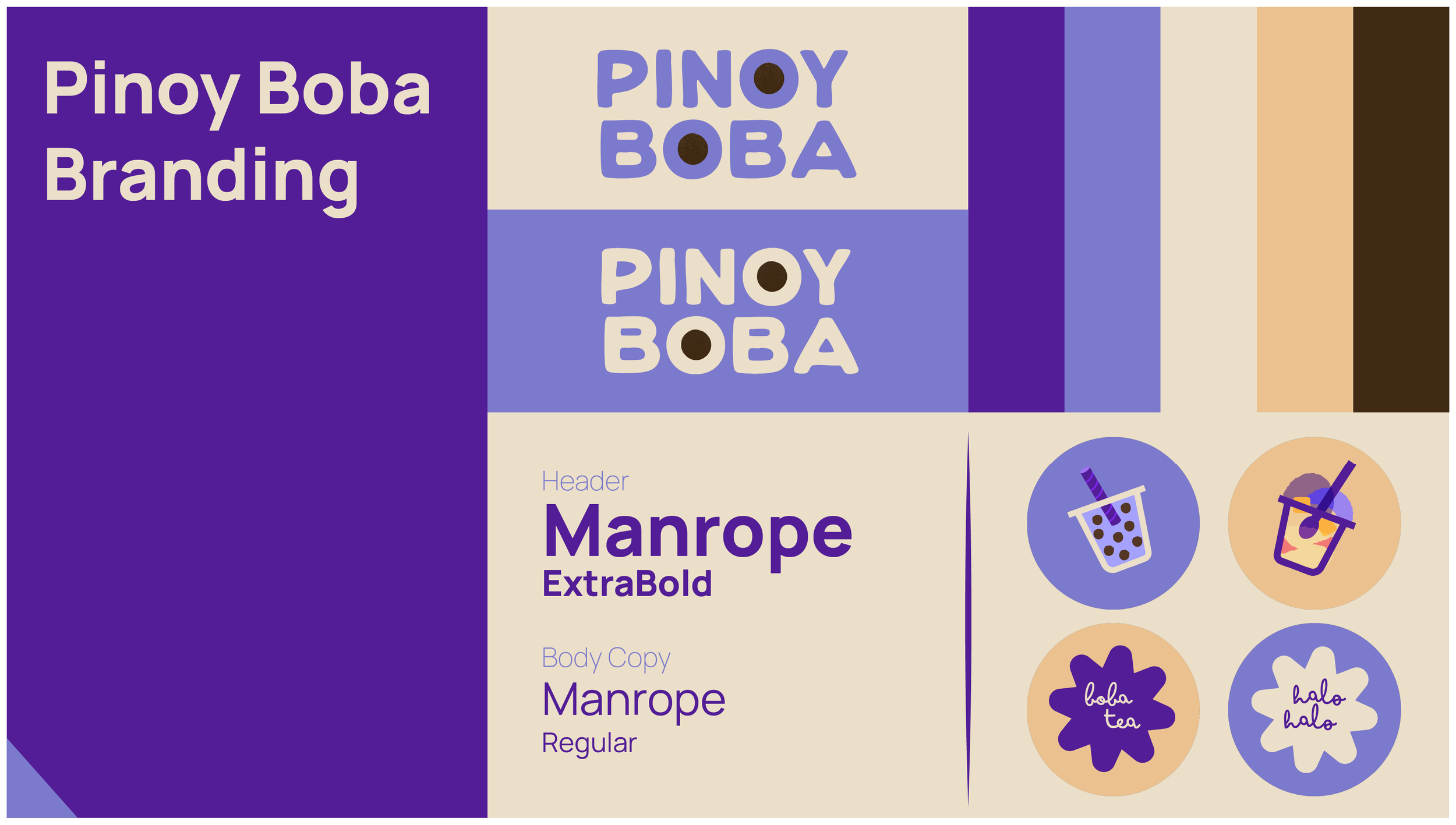
Creating The Brand Vision
Pinoy Boba was inspired by a certain hotspot in my hometown, Gurnee Donuts. They make donuts topped with ube, a purple yam from the Philippines. Their logo is based on this purple donut because it’s a fan favorite. I thought, certainly Pinoy Boba would sell ube-flavored drinks and halo-halo, a “mix-mix” dessert of ube jam, shaved ice, and mango, among other tropical fruits.
The color palette was thoughtfully selected to reflect Filipino culture: vibrant purples inspired by ube, warm tans reminiscent of the islands’ beaches to evoke a tropical atmosphere, and a rich brown representing tapioca pearls. Manrope was chosen as the header typeface for Pinoy Boba to reinforce the brand’s welcoming personality. For body copy, Manrope maintains excellent readability across sizes and formats. Its generous spacing and clear letterforms ensure menus, packaging, and digital content feel accessible and easy to navigate.
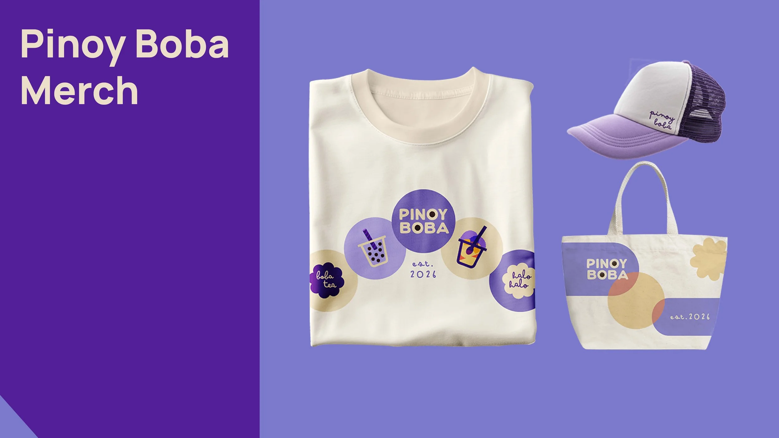
Merchandise
I designed the Pinoy Boba merchandise to be fun and light-hearted using branded elements. The recurring circle motif recalls ‘Boba,’ the iconic tapioca pearls, and popping boba. The tote bag is reminiscent of Bauhaus design, with interacting geometric shapes. The trucker cap displays the brand’s signature colors. Overall, the title ‘Pinoy Boba’ serves as the focal point across all merchandise.
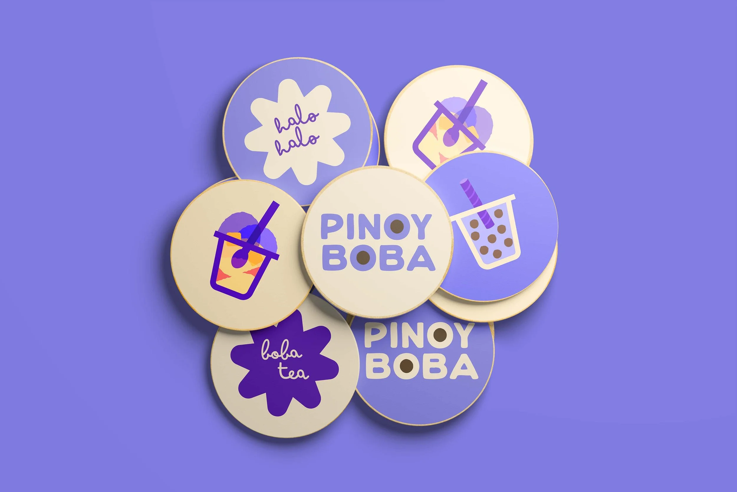
Coasters
The coasters were designed to increase brand awareness while encouraging customers to stay in the cafe and enjoy their drinks. The vector illustrations capture the brand colors interacting to culminate a vibrant playfulness while showcasing the popular drink/dessert options to try next. Created for versatility, the designs can also be repurposed as collectible stickers, extending the brand experience beyond the cafe.
Click to expand images
Figma Workflow: Mobile & Desktop Version
Before designing in Figma, I created website assets, including navigation buttons, category names, and menu cards. These were placed in an ‘Assets’ folder in Figma for easy access. I began with the desktop version of the website. Sections were organized into containers built with frames and auto layout to create responsive, structured UI components.
I titled the containers according to HTML naming conventions (e.g., header, nav, main, footer). For the mobile/app version, I stacked the elements to create a vertical layout. The header/navigation bar was set to a fixed “sticky” position during scrolling, allowing users to navigate between pages at any time. Overall, I prioritized functionality and consistency to convey trust and professionalism.
Web & App Prototypes
Explore the desktop proto and the mobile proto here.
Video edited in After Effects.
Website Design
The website varies between mobile and desktop versions. For example, the mobile site/app features a horizontal logo centered above the nav bar, scaled down to maximize space for larger, more accessible navigation buttons.
I scaled down the typography for readability and ensured there were 45-75 characters per line in the body copy. Additional elements, such as customers’ reviews and a footer, were incorporated to balance the vertical layout. A ‘Next Page’ button was positioned below the main content to guide users’ attention and promote site exploration through directional links (e.g., About→, Merch→, Jobs→).
Motion Graphic Advertisement — Cafe TV Video
This animated advertisement’s goal is to capture audience’s attention while emulating a tropical island atmosphere and representing Filipino culture. This could be played and looped in the cafe environment on TV to engage customers and increase brand memorability or even a commercial intro or outro.
Final Thoughts
Pinoy Boba allowed me to explore UX/UI design in a formative way; I became proficient in Figma by applying my HTML and CSS skills within the software. As a graphic design generalist, I was excited to explore a new area of design where I could apply my style and skills. Overall, Pinoy Boba allowed me to hone my graphic design skills in a UX/UI context, resulting in a project that demonstrates both creativity & functionality.