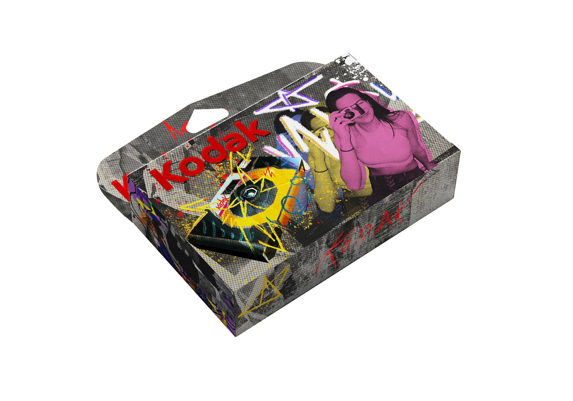

KODAK: Package Design
Kodak’s rising popularity for their disposable cameras presents a unique opportunity to embrace their mistakes from the past and advertise their film cameras, grainy imperfections and all, as a new artistic expression with grunge design. For a History of Graphic Design course, I redesigned Kodak with grunge packaging.

Deliverables
2D Mock-up
3D Mock-up
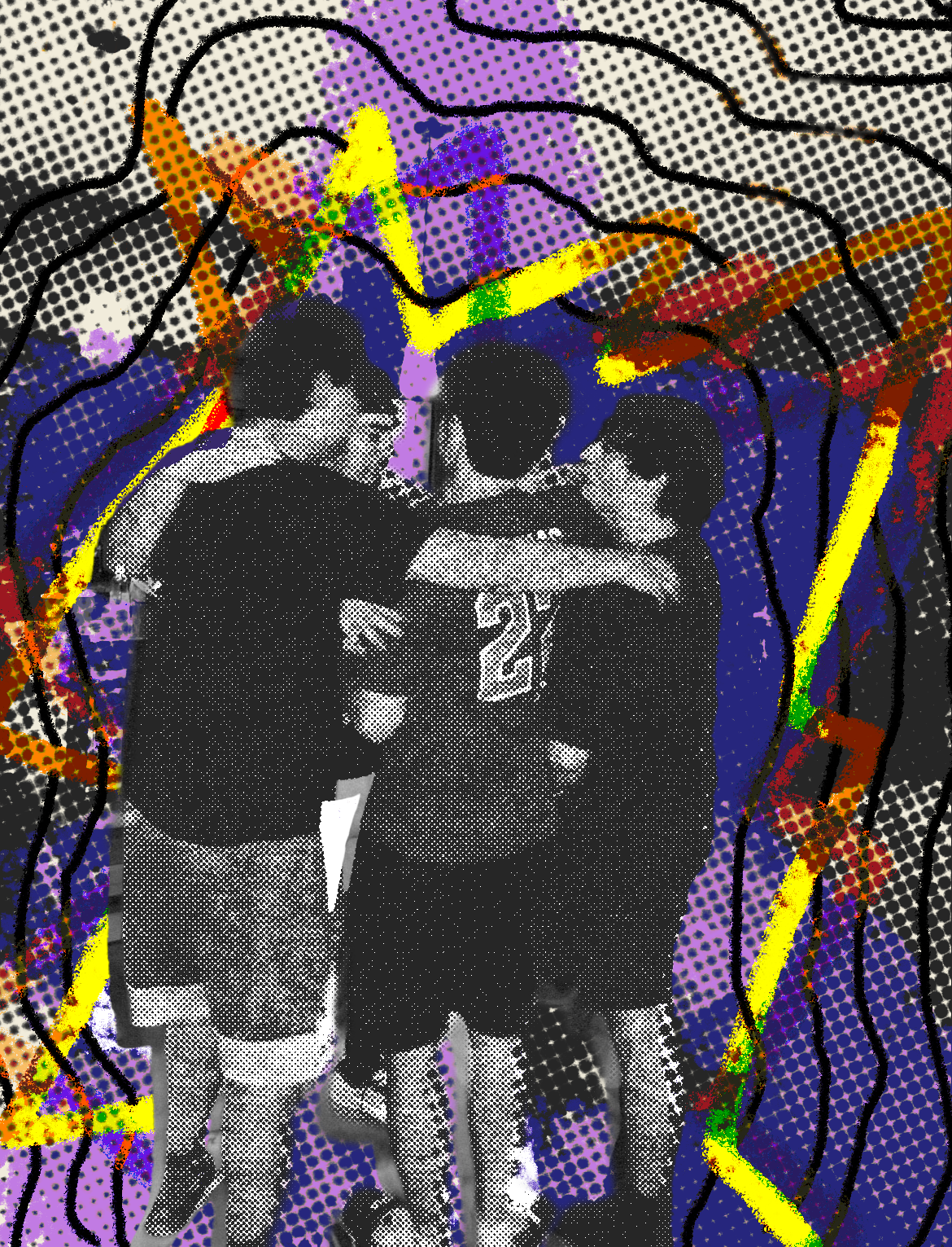
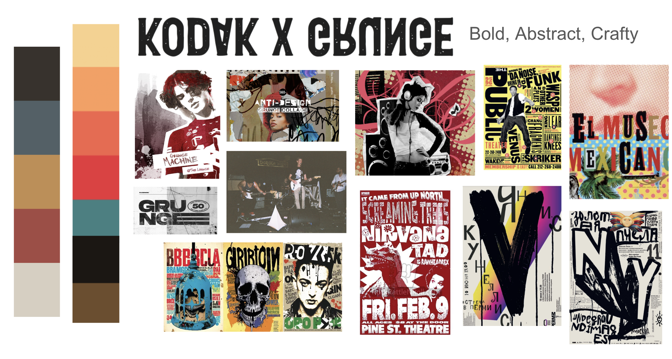
I created a mood board to visualize the Kodak packaging in grunge form, taking inspiration from 90’s design and band posters, such as Nirvana’s. I emphasized mixed media design and the use of gritty textures and drawn elements.
I began designing with photos from my own Kodak disposable camera to create a mixed-media look, similar to grunge. Originally, Kodak’s disposable cameras first became popularized in the 1990’s, alongside the up-and-coming grunge aesthetic.
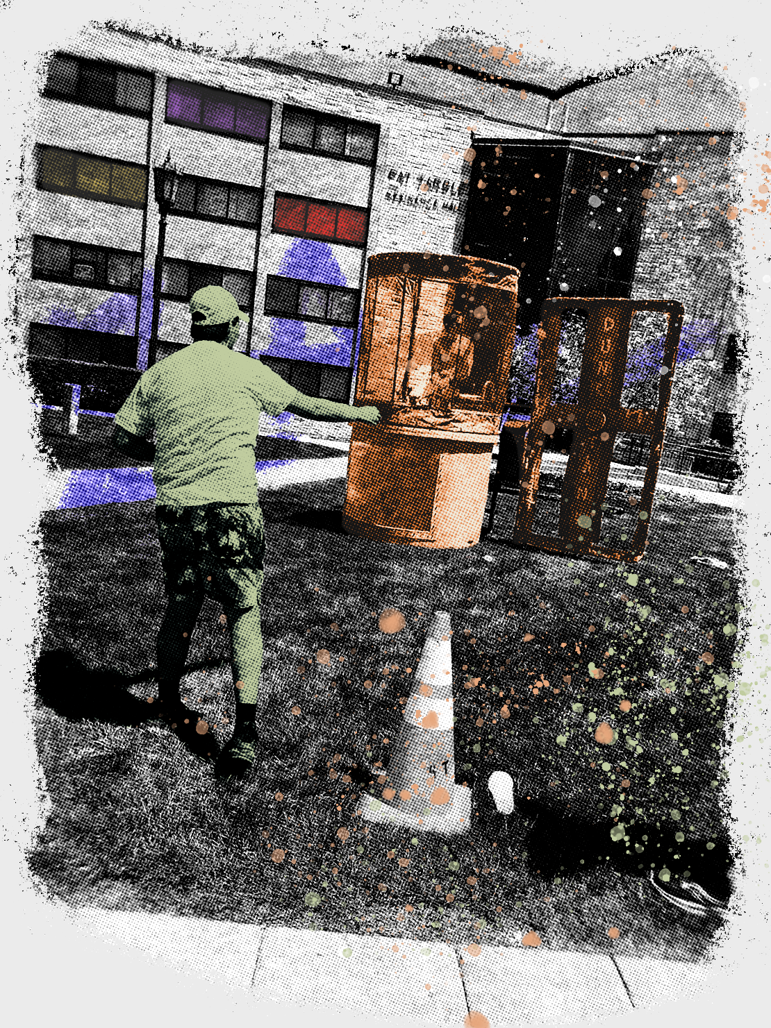
The outcome is grainy, saturated, and overall imperfect, encapsulating the authenticity of the moment. Similarly, The philosophy behind grunge is raw expression of the self and encourages nonconformity. Grunge packaging design would uplift the idea of self expression and creativity.